QWERTY vs Colemak
In today’s post: QWERTY vs Colemak. We’re going to compare these two popular keyboard layouts to see which one is more comfortable. QWERTY is used by millions as the default keyboard layout. Colemak, on the other hand, belongs to a group of modern, ergonomic alternative layouts. We’ll be comparing them in terms of typing comfort, measured by the distance your fingers need to travel to write a given text.
QWERTY

The QWERTY layout is the most popular keyboard layout known to anyone who’s used a computer. You can see the key arrangement in the image above.
A brief history: it was designed in 1873 for use in typewriters. It’s important to note that the layout was created to address the technical limitations of those machines. The QWERTY layout includes two very distinctive characteristics:
Row stagger
Take a look at the keys 1, Q, A, Z — each is shifted by 1/4 of a key’s width compared to the one above.
This stagger has nothing to do with ergonomics or ease of typing. It was purely a mechanical necessity for typewriters. So why do we still use it even though typewriters are obsolete? That’s a topic for a future post.Layout design
If you’ve ever typed on a typewriter, you’ve probably encountered the problem of typebars getting jammed when hitting two nearby keys in quick succession — especially if the hit wasn’t perfectly clean. So what if frequently occurring letters were placed next to each other? The QWERTY layout was deliberately designed to slow down typing of common bigrams by assigning them to the same finger or physically separating them. It was optimized for English bigrams like: th, he, in, en, nt, re, er, an, ti, es.
Colemak

Colemak is an alternative to the QWERTY layout. It was originally designed in 2006 by Shai Coleman. Coleman’s idea was to reduce the physical distance your fingers need to travel while typing. He achieved this by placing the most frequently used letters in English on the so-called Home Row — the middle row of the keyboard.
The layout of these common letters wasn’t random; it was optimized based on English bigrams, which is a completely different design approach compared to QWERTY. Keep in mind that over 130 years separate the invention of QWERTY and Colemak. Colemak is not burdened by the constraints of mechanical typewriters.
Colemak-DHm
Today, we’re comparing standard versions of the layouts, focusing on QWERTY vs Colemak. However, I’d like to mention the version I use daily — Colemak-DHm. This is a slightly modified variant of Colemak, designed for ortholinear keyboards. It eliminates one undesirable feature: row staggering.

QWERTY vs Colemak
The test I want to perform is simple: we’ll count how many typed letters fall on the home row — the middle row your fingers rest on by default.
We’ll express this as a Relative Frequency which can be simply shown as percentage (Percentage = Relative Frequency * 100%). Then, we’ll validate this data using so-called heat maps.
Input Data
The frequency of each letter in English is shown in the chart below:

Let’s analyze this chart with respect to the home row in the Colemak layout. In the chart below, the home row letters are marked in red:

The red highlights show letters located on the home row in Colemak. Summing the relative frequency, we find that while typing in English on Colemak, your fingers rest on the home row about 73,8% of the time.
Now let’s check the same for QWERTY. In the chart below, home row letters are marked in blue:

The blue highlights indicate home row letters in QWERTY. The total percentage comes out to 34%. That means that, statistically, only about one out of four letters typed are on the home row.
So what do you think is more comfortable — 34% or 73,8% of your typing time spent on the home row?
QWERTY vs Colemak in Practice
Theory is one thing — let’s now test QWERTY vs Colemak in practice. To make our test meaningful and not just a self-fulfilling prophecy, we need to set some rules and describe the process.
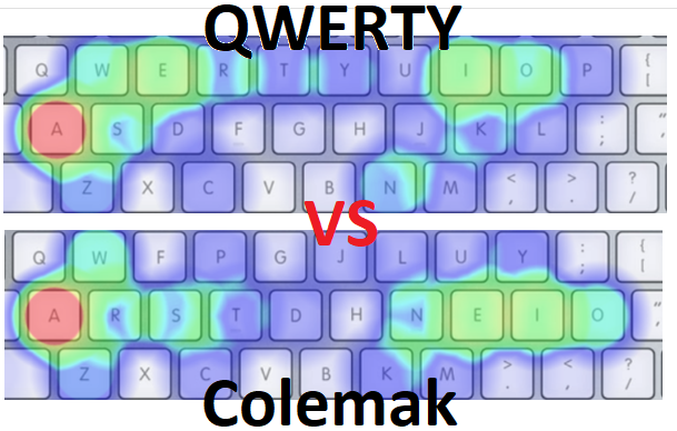
We’ll compare the two layouts using visualizations known as heat maps. These maps show which keys are used most frequently, using bright red to indicate high usage — just like thermal imaging. The redder the key, the more often it’s pressed.
We’ll use a tool that generates heat maps based on input text and a selected keyboard layout. You can find it at: https://www.patrick-wied.at/
We’ll compare the layouts using text written in English. For the input, I chose my article 01. Bad Habits of Typing — why? Because it’s a random, genuine piece of my writing.
Here are the results:
QWERTY

Colemak

Conclusions
The QWERTY heat map for shows the layout’s limitations. Most frequently used letters (shown in bright colors) are on the top and bottom rows. In fact, only one letter — A — is located on the home row.
The Colemak heat map for this text shows perfectly idea of this layout. All bright letters are placed on the home row. Difference is very noticeable.
Colemak provides a significant improvement in reducing finger movement — which is what he was designed to.
Want to see how your text performs on your layout? Try it yourself at https://www.patrick-wied.at/
Verdict: QWERTY vs Colemak
The experiment above shows that the alternative Colemak layout significantly reduces the distance our fingers travel while typing compared to QWERTY. This effect is achieved by placing the most frequently used letters on the middle row—the so-called home row—where our fingers are supposed to rest.
So, can we say that Colemak is better than QWERTY?
Other aspects should certainly be considered, but based on this experiment, I can confidently state that the Colemak layout is definitely more comfortable and more hand- and finger-friendly. Most of the time, your fingers can remain on the middle row, simply pressing keys.
I’d really love to hear your opinion. Please let me know in email on on social media if learning a new ergonomic keyboard layout is worth considering.
☕ Support
Enjoy the insights, guides and reviews? Buy me a coffee to fund more ergo-keyboard research and guides.
Thanks for reading!
Bartosz